Overview
Tag Groups provide options to modify the appearance and sequence of tags shown in the person page entry. The primary purpose of a Tag Group is to display a set of tags, and you may add multiple Tag Groups to isolate groups of tags and alter their appearance. For example, you might want to exclude Census events from the main narrative and include them after the narrative in a tabular format. That configuration would require two Tag Groups, one for all the non-Census events and another for the Census events.
An SDF file must include at least one Tag Group or no tags will appear in the person page entries. Second Site adds Tag Groups to new SDF files that you may customize to suit your preferences.
Example Output
The following image shows a reduced-size screenshot of a person page entry from a Narration Format site with three Tag Groups.
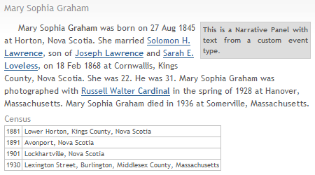
- Tag Group 1 is for the tags in the main narrative.
- Tag Group 2 creates a "call out", a narrative section of the page used to highlight some text.
- Tag Group 3 creates a list of Census tags in a tabular format. The group's title appears as a heading above the table.
Using Tag Groups
You manipulate Tag Groups via the list in the Person Entry section. This list is similar to other item lists such as the User Items list and shows the title of the Tag Group. You may enable or disable the Tag Group using the checkbox in the list or via the Enabled property in the edit window. The buttons below the list support adding, editing, deleting, and duplicating Tag Groups in the list. You may edit an existing Tag Group by double-clicking the item.
You may configure Tag Groups to select a subset of tags, render the tags in a "panel" that is visually distinct from other Tag Groups, choose different formatting structures such as narratives, lists, and tables, and apply CSS styles to increase the visual differences between Tag Groups.
Note If you use a mix of Tag Groups, you may find that the default spacing between panels does not always produce optimal results. This is especially true when using floating panels. The layout may be optimized using the Stylesheets.System.Tag Groups subsections that alter the appearance of Tag Group panels, but in some cases it will be necessary to create User Styles. The HTML and CSS Information section below provides information that will help you create User Styles that apply to Tag Groups.
Default Tag Groups
When you create a new SDF file, Second Site automatically adds two Tag Groups. Users may modify the default Tag Groups and add additional Tag Groups to suit their preferences.
- The BMDB First group renders BMDB tags in the first segement of output. It is primarily intended for narrative sites, but it may be used with any Format. The group is disabled by default. The BMDB First group replaces the BMDB First option that was present in prior versions of Second Site. It produces the same output, but unlike the old option, the BMDB First tag Group can be customized.
- The Body group selects all tag types and renders them in the Format chosen for the site. If the BMDB First group is enabled, BMDB tags will be rendered as part of that group and will not be included in the Body group due to the configuration of the BMDB First group.
Tag Group Types
There are six types of Tag Groups divided into two categories.
| Category | Type |
|---|---|
| Body | Body |
| Panel | Block Panel |
| Panel | List Panel |
| Panel | Narrative Panel |
| Panel | Table Panel |
| Panel | No Output |
You set the Tag Group Type using the Group Type pull-down menu. The default is "Body".
Body Groups
A Body Tag Group contributes tags to the main body of the tag list in a person page entry. Tags that are part of the body are formatted according to the Format chosen for the site. For example, if your site uses the Narration Format, any tags that are part of a Body Tag Group will be part of the main narrative. Similarly, if your site uses the Three Columns Format, each tag in a Body Tag Group will appear as a row in the main three-column tag grid. In the example above, Tag Group #1 is a Body type in a site that uses the Narration Format.
Panel Groups
A Panel Tag Group contributes tags to a sub-section of the tag list called a "panel". A panel may be rendered inline with respect to the body tags, floated left or right, or centered. There are multiple variations of the Panel type: Block Panels, List Panels, Narrative Panels, and Table Panels.
Block Panels
Block Panels use a cellular format where each tag in the group contributes one cell of output. The cells are arranged sequentially left to right, and will wrap to additional rows if required. You determine the content of the cell using a sentence structure that is similar to TMG sentence structures, and where you may use the tag's sentence to determine all or part of the content. Block Panel options are described in the Block Panel Tab section below.
List Panels
List Panels use a list format where each tag contributes an item to the list. List Panel options are described in the List Panel Tab section below.
Narrative Panels
Narrative Panels use a narrative format where each tag contributes text to the narrative in the panel. In the example above, Tag Group #2 is a Narrative Panel type. Narrative Panel options are described in the Narrative Panel Tab section below.
Table Panels
Table Panels use a tabular format where each tag in the group contributes a row of output. You may configure from one to three columns per tag, and you have several content choices for each column. In the example above, Tag Group #3 is a Table Panel type. Table Panel options are described in the Table Panel Tab section below.
No Output Groups
The No Output type is unique in that no output is rendered. You can use the No Output type to prevent tags from being visible. Set the Tag Group Type to No Output and also set the Exclude Options to prevent the selected tags from being selected by subsequent Tag Groups.
For selection purposes, the No Output type is treated as a Panel group.
Tag Group Properties
Show Title
The Show Title checkbox controls whether the title of the Tag Group is displayed in the output as a heading. You may adjust the style of the heading using the Stylesheets.System.Tag Groups.Tag Group Heading section. See the HTML and CSS Information section for help defining User Styles to customize headings for a particular Tag Group.
Sort
The Sort pull-down menu controls the sequence of the tags. There are two choices, By Date and By Tag Group and Date.
If you choose By Date, which is the default, the tags in the group will be sorted by the tag's Sort Date. Note that when when two or more tags have the same Sort Date, the output sequence is unpredictable.
If you choose By Tag Group and Date, the tags in the group will be sorted by the TMG Tag Type Group and then by Sort Date. This is an appropriate choice to force BMDB tags into BMDB sequence, for example. The sequence of Tag Type Groups is shown below.
| Tag Type Group |
|---|
| All Name Tags |
| Birth Group Tags |
| Marriage and Divorce Group Tags |
| Death Group Tags |
| Burial Group Tags |
| Address, Other, and History Group Tags |
When you choose By Tag Group and Date, primary events sort before non-primary events within each Tag Type Group.
Tabs
The remaining Tag Group properties appear on one of four tabs. The properties on the Person Filter and Tag Filter tabs control which people and which tags are part of the Tag Group. The properties on the remaining tabs control the appearance and format of the content of the Tag Group.
Person Filter Tab
You may filter tags based on the person to whom the tags are attached. The Person Filter uses a flag-based filter where you select a flag label, "Include" or "Exclude", and one or more values. If the operator is "Include", then people whose flag value matches one of the specified values will qualify for the Tag Group. If the operator is "Exclude", then people whose flag value does not match one of the specified values will qualify for the Tag Group.
Set the Flag pull-down menu to "None" to disable the person filter.
Tag Filter Tab
You may filter tags based on the Tag Type, the primary marker, and whether or not the person is attached to the tag as a principal, witness, or virtual witness. If no tags for a particular person pass the filters for a Tag Group, that Tag Group will not appear in the person page entry for that person.
If you set the Tag Filter pull-down menu to "All", then all tags will be selected. If you set it to "BMDB Only", then all Birth Group, Marriage Group, Death Group, and Burial Group tags will be selected. For both of those choices, the Tag Types list will be disabled.
If you set the Tag Filter pull-down menu to "Selected", then you may select specific tag types by checking one or more items in the Tag Types list.
You may suppress a Tag Group based on the number of tags that qualify for a particular person using the Min Tags and Max Tags properties. If the number of qualifying tags is less than the minimum or more than the maximum, the Tag Group will not be included in the person page entry for that person.
Exclude Options
In most cases, users will want a tag to appear in a single group only. If a tag is selected for a Tag Group, you may use the Exclude Options to prevent the tag from appearing in other groups. These properties make it easy to control whether or not a tag will appear in multiple groups without having to ensure that the tag selection filters are mutually exclusive.
For Panel Groups, the Exclude Options are Exclude from Body Groups and Exclude from Subsequent Panel Groups. When Exclude from Body Groups is checked, any tag selected by the Panel Group will not be eligible for any Body Group. When Exclude from Subsequent Panel Groups is checked, any tag selected by the Panel Group will not be eligible for any Panel Group that is after the current Panel Group in the list of Tag Groups.
For Body Groups, only one property is available: Exclude from Subsequent Body Groups. When Exclude from Subsequent Body Groups is checked, any tag selected by the Body Group will not be eligible for any Body Group that is after the current Body Group in the list of Tag Groups.
Tag Filter Processing Sequence
When determining which tags qualify for each Tag Group, Second Site processes the filters for all the Panel Groups first, and all the Body Groups second. Within each category, it processes the filters in the sequence the groups appear in the Tag Groups list. For example, if an SDF file had four Tag Groups as shown in the table on the left, the tag selection filters would be applied in the sequence shown on the right.
| List Sequence | ||
|---|---|---|
| # | Title | Type |
| 1 | Main Body | Body |
| 2 | Callout | Narrative Panel |
| 3 | Census | Table Panel |
| 4 | Research Notes | Table Panel |
| Filter Processing Sequence | ||
|---|---|---|
| # | Title | Type |
| 1 | Callout | Narrative Panel |
| 2 | Census | Table Panel |
| 3 | Research Notes | Table Panel |
| 4 | Main Body | Body |
The filters are applied to Panel Groups first to make it easy to remove tags from the main body and display them in a panel instead. If a tag is selected by a Panel Group where Exclude from Body Groups is checked, the tag is not eligible to be included in any Body Groups even if the tag filters for one or more Body Groups would select the tag.
Body Tab
For Body Groups, the only appearance option is the New Paragraph checkbox. When checked, and when the main Format for the site is a narrative-type Format, Second Site will strip any leading white-space ([:CR:], [:TAB:]) and then insert a prefix before the first tag. Second Site will use the Strings.Sentence Strings.Paragraph Indent text as the prefix when it determines that a line break is not required. Second Site will use the the Strings.Sentence Strings.Paragraph Two Indent text as the prefix when a line break is required.
As a result of the processing described above, if you use the New Paragraph option you do not have to worry whether or not the TMG sentence for first tag in a Tag Group uses [:CR:] codes to start a new paragraph. If it does, Second Site will remove them and use the appropriate codes from the Strings.Sentence Strings section. If it does not, Second Site will add the codes. If you have added codes to your TMG sentences to control TMG's narrative reports, you can leave them in place. If you do not use the New Paragraph option, Second Site will only create a new paragraph if Show Title is checked, and any other new paragraphs are determined by the TMG sentence structures.
When Show Title is checked, the New Paragraph property is disabled; any text that follows the heading will automatically start a new paragraph.
The New Paragraph property is useful when using Tag Groups to rearrange the sequence of tags. For example, to create a narrative where the BMDB tags are in paragraph one, and all the remaining tags are in paragraph two, you would define two groups:
| # | Title | Type | Description |
|---|---|---|---|
| 1 | BMDB Only | Body | The tag filters for this group would select primary birth, marriage, death, and burial events. Exclude from Subsequent Body Groups would be checked. |
| 2 | Body | Body | New Paragraph would be checked so that the first tag in the group would start a new paragraph. The tag filters for this group would be disabled so that all tags qualify. Even though all Tag Types qualify, any tags selected by the BMDB Only group above would not be eligible and would not be included in this group because the Exclude from Subsequent Body Groups option is checked in group one. |
Block Panel Tab
The Block Panel Tab options control the arrangement and content of the cells.
Spread By
The Spread By choices are None, Date, and Decade.
- When Spread By is set to None, there will be a cell for every tag. The left-most cell will be the tag with the earliest date, and the right-most cell will be the cell with the latest date.
- When Spread By is set to Date, tags with the same date will be in a single cell. The left-most cell will be the tag(s) with the earliest date, and the right-most cell will be the tag(s) with the latest date. Spread By Date will produce the same output as Spread By None if no cells share the same date value.
- When Spread By is set to Decade, there will be a cell per decade. The range of decades is initially determined by the lifespan of the subject, but that range will be expanded, if necessary, to include the date range of the selected tags. The left-most cell will be the earliest decade, and the right-most cell will be the latest decade. The Block Panel Tag Group with Spread By set to Decade is limited to tags that have a regular date with a non-zero year.
When using Spread By Decade, there may be empty cells in the panel. You may alter the cell headings and cell formatting for empty cells.
See the examples below for a demonstration of how the various Spread By choices affects the output.
Cell Heading and Content
The Cell Heading textbox determines the heading content for a cell. The text is interpreted as a TMG sentence structure and may refer to TMG date variables [Y] and [D] as well as TMG printer codes. The Cell Heading Content may also use some of the special variables described below.
The Empty Cell Heading textbox determines the heading content for a cell when no tag qualifies for the cell. The usage is the same as described above for Cell Heading Content.
The Cell Content textbox determines the contents of the cell. You may use TMG sentence structure variables and also the special variables described below to determine the contents.
Here is an example of a Cell Content value:
[SS-TAGLABEL]<[:CR:][L3]><[:CR:][L5]><[:CR:]w/[SS-OTHERPEOPLE]>
The content will include the label of the tag ([SS-TAGLABEL]), two elements of the location, each conditional and preceded by a line break (<[:CR:][L3]><[:CR:][L5]>), and a list of the people attached to the tag excluding the subject (<[:CR:]w/[SS-OTHERPEOPLE]>).
Cell Dimensions
The min-cell-width, max-cell-width, min-cell-height, and min-cell-height textboxes determine the minimum and maximum dimensions of the block that encloses the cell content. You may use pixel values, in which case you specify a number only, or you may use other units if you add the unit yourself. So, the value "200" will be interpreted as "200px" whereas "8em" will be left as is. For widths, "1em" is the width of the letter M in the current font. For heights, "1em" is the height of the letter M.
When the minimum value is not the same as the maximum value, the browser will vary the size of the block using the content as a guide. If you anticipate that a sequence of cells might require two or more rows of output, it's usually best to set the minimum height the same as the maximum height. Otherwise, the blocks will not be aligned in uniform-height rows.
Extra Events
If Add Primary Birth and Death is checked, Second Site will add the primary birth and death events, if any, to the output. When added in this manner, those events are not subject to the exclusion processing that is applied to events added via the Tag Filter tab. This allows you to add the primary birth and death to the panel without affecting the explicit inclusion of birth and death events in other Tag Groups.
Citations and Exhibits
The Show Citations checkbox determines whether or not citations are added to the contents. The default is checked, and citations attached to the tags will be included. You may wish to uncheck Show Citations when a Block Panel includes tags shown elsewhere in the person page entry.
The Show Exhibits checkbox determines whether or not exhibits are added to the contents. The default is checked, and exhibits attached to the tags will be included. You may wish to uncheck Show Exhibits when a Block Panel includes tags shown elsewhere in the person page entry.
White Space
The Remove Leading White Space checkbox determines whether or not Second Site removes leading white space when processing the content of the cell. If you use the [SS-SENTENCE] variable, and the sentence for the tag begins with [:CR:] or [:TAB:] codes to produce newlines or indentation in TMG reports, you can undo the effect of those codes by using the Remove Leading White Space option. The default is checked, and it's usually best to leave it that way.
Spread By None Example
Assume the subject—the person whose person page is being constructed—has the following events:
- Primary birth 1858
- Primary death 1903
- Census event in 1860
- Census event in 1880
- Residence event in 1893
Also assume that we have defined a Block Panel Tag Group that includes all Census event types and also the Residence event type.
The cell contents are defined as follows:
- Cell Heading: empty
- Cell Content:
[Y][:CR:][SS-TAGLABEL]<[:CR:][L]>
The resulting output:
Boston, MA
Boston, MA
Newton, MA
Spread By Decade Example
Assume the same person and events as used above for the Spread By None example.
The cell contents are defined via the following Tag Group properties:
- Cell Heading:
[SS-DECADE] - Cell Content:
[SS-TAGLABEL]<[:CR:][L]> - Empty Cell Heading:
[SS-DECADE]
The resulting output:
Boston, MA
Boston, MA
Newton, MA
The range of cells begins with 1850 and ends with 1900 based on the lifespan of the subject. The cells have been formatted to emphasize the difference between cells with content and cells without content.
The 1850, 1870, and 1900 cells are empty because there were no tags included within those decades. The content is determined by the Empty Cell Heading property.
The 1860, 1880, and 1890 cells include content based on the Census and Residence events. The content is determined by the Cell Heading and Cell Content properties. The 1893 Residence event appears under the heading 1890 because the Cell Heading includes the decade of the event and the Cell Content does not include the event year.
Special Variables for Block Panel Contents
You may use TMG variables to define the contents of the cells in the Block Panel, including [D], [Y], [L], [M], etc. You may also use the following variables and codes that are valid within Block Panel content properties:
| Variable | Description | Valid In |
|---|---|---|
| [SS-DECADE] | Returns the decade derived from the date of the tag. For the Cell Heading and Empty Cell Heading properties, uses a tag with the date set to the first year of the decade and empty otherwise. | All |
| [SS-PEOPLE] | Returns a list of all the people attached to the event. | Cell Content |
| [SS-OTHERPEOPLE] | Returns a list of all the people attached to the event but excludes the subject. | Cell Content |
| [SS-ROLENAME] | Returns the name of the role of the subject for the current tag. | Cell Content |
| [SS-SENTENCE] | Returns the output derived by processing the subject's sentence structure for the current tag. | Cell Content |
| [SS-TAGLABEL] | Returns the label of the current tag. | Cell Content |
| [:SS-CS:] | Returns a comma and a space if the prior output for the cell is not empty, or returns an empty value otherwise. | Cell Content |
The [:SS-CS:] variable is useful when combining output from multiple variables. For example, if you have defined the cell content sentence structure as <[D]><[:SS-CS:][L]>, the table below shows various possible results given the dates and places shown:
| Date | Place | Result |
|---|---|---|
| 1 June 1940 | Massachusetts | 1 June 1940, Massachusetts |
| 1 June 1940 | empty | 1 June 1940 |
| empty | Massachusetts | Massachusetts |
| empty | empty | empty |
List Panel Tab
The List Panel Tab options control the content and format of the list.
The Item Content pull-down menu controls the content of the list item. The default is "Date, Place, and Memo". The Item Content choices are the same as for each Column Content option in a Table Panel Group, and the choices are described in the Data Content Choices section below.
The List Output Type pull-down menu controls the rendering of the list. The choices are Simple List and Person Entry List. A Simple List is rendered using the HTML UL and LI elements and typically produces a bulleted list of items with one event per list item. A Person Entry List follows the structure used by the current Format. The Person Entry List choice will render the list so it is similar to the lists of chart membership, index membership, etc.
The Remove Leading White Space checkbox determines whether or not Second Site removes leading white space when processing the content of the cell. If you set the List Output Type to Use sentence, and the sentence for the tag begins with [:CR:] or [:TAB:] codes to produce newlines or indentation in TMG reports, you can undo the effect of those codes by using the Remove Leading White Space option. The default is checked, and it's usually best to leave it that way.
Narrative Panel Tab
For Narrative Panel Groups, the only option is the New Paragraph checkbox. This option works similarly to the same option for Body groups and is described above.
Table Panel Tab
The Table Panel Tab options control the data columns included in the Table Panel. You may define from one to three columns, including the data content, the CSS class, and an optional heading. If you need only one or two columns, set the Content choice for one or two of the columns to "None".
The Column Content choices are described in the Data Content Choices section below.
The Column Class choices are "Table Panel Cell", "Grid Column 1", "Grid Column 2", and "Grid Column 3", and those classes are defined in subsections of the Stylesheets.System section. The default is "Table Panel Cell". Even though the "Grid Column" classes are numbered, the right choice may not always match the column number.
The "Grid Column 1" class typically has left-aligned text and is appropriate for a tag label. The "Grid Column 2" class typically has centered text and appropriate for a date or for the middle column in a three-column panel. The "Grid Column 3" class typically has left-aligned text and is appropriate for a column with a long text value such as "Date, Place and Memo", or "Use sentence".
The Column Heading textboxes are used to define column headings. If all the column headings are empty, the table will not include a heading row.
Panel Options Tab
The Panel Options Tab is only available for Panel groups. The options on this tab affect the layout and appearance of the panel.
The Alignment pull-down menu controls whether the panel floats left or right, is centered, or is inline with the Body content. The exact placement of floating panels depends on the main Format for the site. For narrative Formats, the body text will flow around floating panels, as shown by panel two in the example output above. For grid-like Formats, floating panels will float next to each other only.
The Clear pull-down menu controls how the location of the panel is affected by floating elements. See the description of the Clear property on the User Items help page.
The Width property controls the width of the panel. If you want the browser to determine the width, set the width to zero. Otherwise, set it to the desired width, in pixels. If the Alignment is set to Left or Right, you must specify a non-zero width or the browser may not render the page properly.
The Height property controls the height of the panel. If you want the browser to determine the height, set the height to zero. Otherwise, set it to the desired height, in pixels.
The User Class textbox allows you to specify the name of a CSS class that will be added to the panel's container. Add a user class to customize the appearance of a particular Tag Group panel. See the HTML and CSS Information below for more details.
The Place Format pull-down menu controls the content of places that appear in the Tag Group output. The Full Place, Short Place, and Full, then Short options work the same way as the site-wide options described in the Places Section. You may also choose "Inherit", in which case the Tag Group will use the value chosen in the Places Section.
The Place Style pull-down menu controls whether the place style is used to format the place. You may choose "Use Place Style" or "Do Not Use Place Style". You may also choose "Inherit", in which case the Tag Group will use the Place Style if Use Place Style is checked in the Places Section.
Data Content Choices
The data content choices include a variety of tag-related information including the label, date, place, memo, etc. The last column has an additional choice, "Use sentence", where the tag's sentence determines the content of the column.
| Choice | Description |
|---|---|
| None | Set the content choice to None to omit the column from the output. |
| Tag Label | The label from the tag, such as "Birth", "Note", etc. This is typically the same as the Tag Type but there are some exceptions for Flag Events, Virtual Events, etc. |
| Tag Abbreviation | The tag's abbreviation, such as "b." for "Birth". |
| Role | The subject's role, "Principal", "Bride", etc. |
| Label and Role | The Tag Label and Role concatenated in a single column and separated by a comma. |
| Label or Role | For principals, the Tag Label. For witnesses, the Role. |
| Role and Label | The Role and Label concatenated in the reverse sequence compared to the above. |
| Tag Abbreviation and Role | The Tag Abbreviation and Role combined in a single column and separated by a comma. |
| Subject | The name of the subject; the same as [S+] in a TMG sentence structure |
| Principal | The name of the principal; the same as [P+] in a TMG sentence structure |
| Other Principal | The name of the other principal; similar to [PO] in a TMG sentence structure except that if the subject is a witness, Other Principal will return P1 |
| People | A list of the names of all the people attached to the event |
| Other People | A list of the names of all the people attached to the event except for the subject |
| Date | The tag's date. |
| Date and Place | The tag's Date and Place combined in a single column and separated by a comma. The comma is omitted if either element is blank. |
| Date and Memo | The tag's Date and Memo combined in a single column and separated by a comma. The comma is omitted if either element is blank. |
| Date, Place and Memo | The tag's Date, Place and Memo combined in a single column and separated by commas. The commas are omitted for blank elements. |
| Year | The year extracted from the tag's date. |
| Year and Place | The tag's Year and Place combined in a single column and separated by a comma. The comma is omitted if either element is blank. |
| Year and Memo | The tag's Year and Memo combined in a single column and separated by a comma. The comma is omitted if either element is blank. |
| Year, Place and Memo | The tag's Year, Place and Memo combined in a single column and separated by commas. The commas are omitted for blank elements. |
| Place | The tag's Place. |
| Place and Memo | The tag's Place and Memo combined in a single column and separated by a comma. The comma is omitted if either element is blank. |
| Memo | The tag's Memo. |
| Use sentence | The output from processing the tag's sentence. This choice is only available in the definition of the third column. |
As mentioned above, the "Use sentence" choice is only available for the third column. If you do not want three columns, but you want a column to include the sentence output, set one or both of columns one and two to "None".
Special Tag Types
Certain custom Tag Types trigger special handling. The Tag Types are identified via a naming convention where the Tag Type must begin with the prefix ss- and end with a suffix that is specific to the type of processing desired. This naming convention allows users to create multiple Tag Types for each of the special processing types. Having multiple Tag Types that trigger the same special handling allows users to add different Tag Types to different Tag Groups.
ss-heading
When the label of a Tag Type begins with ss- and ends with -heading, the tag's sentence will be rendered as a heading in the output.
You may create multiple Tag Types that trigger this processing. The following Tag Type labels all match the suffix and prefix rule:
ss-heading, ss-census-heading, ss-whatever-heading
Heading tags allow users to generate Tag Group headings based on data stored in TMG rather than using the Titles defined as part of Tag Groups. Typically, when you include a heading tag in a Tag Group, you will want to (A) uncheck the Show Title property and (B) make sure that the heading tags have Sort Dates that make them the first tag in their Tag Group.
As mentioned above, the text of the heading is generated using the sentence of the heading tag. You should add [:NP:] to the TMG sentence structure if you do not want the heading to end with a period.
You may include multiple heading tags in the same Tag Group, and they may have the same or different Tag Types. In the following example, a single heading Tag Type is used (ss-census-heading), but there are two tags of that type. The table shows a set of events for a particular person. The events are in a single Tag Group, and in the sequence shown:
| Tag Type | Date | Memo |
|---|---|---|
| ss-census-heading | 1849 | Canadian Census, 1850-1899 |
| Census1871 | 1871 | |
| Census1881 | 1881 | |
| ss-census-heading | 1899 | US Census, 1900-1920 |
| Census1900 | 1900 | |
| Census1910 | 1910 | |
| Census1920 | 1920 |
When Second Site creates the output for this Tag Group, the heading tags will create two sections of output and the tags after the second heading tag will appear to have come from a separate Tag Group. For a List Panel Group, the output might look like this:
- Census1871, 75 Main Street, Lunenburg, Nova Scotia
- Census1880, 75 Main Street, Lunenburg, Nova Scotia
US Census, 1900-1920
- Census1900, 237 Andover Street, Haverhill, Massachusetts
- Census1910, 237 Andover Street, Haverhill, Massachusetts
- Census1920, 14 Dunster Street, Harvard, Massachusetts
The "Census 1900-1920" heading tag was not the first output tag in its Tag Group, so Second Site created a new section of output in order to render the heading.
If Show Title is checked and the first output tag is a heading tag, the output will include the Tag Group's Title as a heading, as usual, but the output section that includes the Tag Group's heading will not include any tags. The heading tag will trigger another heading and so there will be two headings in a row followed by the remaining tags in the group.
ss-nolabel
When the label of a Tag Type begins with ss- and ends with -nolabel, Second Site will suppress the tag's label when the tag is part of tabular output such as a Table Panel or a tabular Format such as Two Columns or Three Columns.
You may create multiple Tag Types that trigger this processing. The following Tag Type labels all match the suffix and prefix rule: ss-nolabel, ss-census-nolabel, ss-whatever-nolabel.
Suppressing the label may be desirable when you have two events that are logically connected and the second event explains something about the first but is not formally part of the initial event. In the "Using Note Event" example below, a Census1880 event is followed by a Note event. In the "Using ss-nolabel Event" example, the Census1880 event is followed by an "ss-nolabel" event.
Using Note Event
| Census1870 | 6 Jun 1870 | John Smith and Jane Doe appeared on the census of 1870 at 101 Main Street, Boston, Suffolk County, Massachusetts. |
| Note | John Smith's mother Alice (Jones) Smith was not enumerated in the household but she was listed in a city directory at the same address. |
Using ss-nolabel Event
| Census1870 | 6 Jun 1870 | John Smith and Jane Doe appeared on the census of 1870 at 101 Main Street, Boston, Suffolk County, Massachusetts. |
| John Smith's mother Alice (Jones) Smith was not enumerated in the household but she was listed in a city directory at the same address. |
HTML and CSS Information
The following information is intended for advanced users.
Multiple CSS classes are assigned to the HTML containers that enclose the tag output for Panel Tag Groups. Body Tag Groups are handled by the Format and most of the information in this section does not apply to them.
All Panel Tag Groups are enclosed in a DIV element container. The container is subject to the Alignment and Clear options and ensures that the heading, if any, stays with the tag content. Multiple CSS classes are assigned to the container based on the choices for those options. The main content HTML and CSS varies by the type of Panel group.
Headings
If the Show Title checkbox is enabled, or if the Tag Group includes heading tags, the container will enclose an H3 element where the Tag Group title is used as a heading. The H3 element is assigned the CSS class "tg-heading". To modify the style attributes of all Tag Group Headings, modify the properties in the Sylesheets.System.Tag Groups.Tag Group Heading section.
To modify the style of a heading for a particular Panel group, add a User Class to the Tag Group and a User Style that references that class. The instructions below for each Panel group type (Table, Narrative, List) include examples of the selectors you need to customize Tag Group headings for one of those panels. The technique is the same in all cases. Body group headings cannot be customized at the group level.
Tag Group Layout and Spacing
In some cases, it may be necessary to apply User Styles to get the desired spacing and appearance when using multiple Tag Groups. Specify a User Class to set the name of a CSS class, and use the rest of the information in this section to determine how to modify specific attributes of the Tag Group output via User Styles that reference the User Class.
If you have too much or too little spacing between Tag Groups, these are the factors to consider:
- Alignment: Panels that are aligned left or right use the CSS "float" parameter to allow other content to flow next to the panel. If you do not want other content to appear on the left or right of a given panel, set the Alignment to "Inline" or "Center".
- Clear: Use the Clear parameter to control the layout of the panel with respect to floating panels (or other floated items) that are near the panel in question. Setting Clear to "Both" will isolate the current panel from its neighbors.
- Margins: If you have too little or too much space around a panel, you may have to adjust the margins. By default, the margin values are determined by the Alignment parameter. So, for example, a panel that is floated left will have a top-margin of 1em, and a few pixels on the right and bottom. (1em of height is equivalent to the height of one line of text in the current font.) Depending on the margins of the items that are before and after the floated panel, those margins may or may not be correct.
If you encounter spacing issues related to Tag Groups, it's usually best to avoid adding [:CR:] codes to TMG tags. There may be rare occassions where there is no alternative, but usually, they won't help and they often make the problem worse. You should use [:CR:] codes to create a new paragraph when the tag is not the first tag in a group, and avoid them otherwise. For more information about new paragraphs, see the description of the New Paragraph option.
Table Panels
A Table Panel uses the standard outer DIV element as a container, an optional H3 element for the heading, a TABLE element to define the table, and finally TR and TD elements for the tags. For example, an inline Table Panel uses the following HTML and CSS:
<div class="panel-tags panel-tags-inline panel-table">
   <h3 style="tg-heading">Tag Group Title</h3>
   <table class="grid">
       ... tag rows here ...
   </table>
</div>
The panel-tags and panel-tags-inline classes are described in the CSS Classes table below. The panel-table class is assigned to the container DIV of Table Panels. The main characteristics of that CSS class are set via the CSS properties in the Stylesheets.System.Tag Groups.Table Panel section.
The tags in the Panel are enclosed by the TABLE element. The main characteristics of that table are set via the CSS properties in the Stylesheets.System.Person Pages.Grid section. The Stylesheets.System.Tag Groups.Table Panel Headings section controls the appearance of the heading cells in the table. The Stylesheets.System.Tag Groups.Table Panel Cells section controls the appearance of the data cells in the table.
If you assign a User Class to the Tag Group, that class name will be added to the outer DIV element and to the TABLE element. You may use any valid CSS class name for a User Class. For example, if you use the class name "user-table", that class name will be added to the HTML as follows:
<div class="panel-tags panel-tags-inline
         panel-table user-table">
   <h3 style="tg-heading">Tag Group Title</h3>
   <table class="grid user-table">
       ... tag rows here ...
   </table>
</div>
Use the following selectors as a guide to create User Styles for Table Panels:
| Selector | Description |
|---|---|
| div.user-table | CSS parameters associated with this selector will affect the Table Panel. Some attributes associated with this selector may be inherited by the inner TABLE, but that depends on the specific parameters you use. |
| div.user-table h3.tg-heading | CSS parameters associated with this selector will affect the H3 element (heading). |
| div.panel-table table.user-table | CSS parameters associated with this selector will affect the TABLE element. |
| div.panel-table table.user-table th | CSS parameters associated with this selector will affect the TH elements (heading cells) in the table. |
| div.panel-table table.user-table th | CSS parameters associated with this selector will affect the th elements (data cells) in the table. |
Narrative Panels
A Narrative Panel uses the standard outer DIV element as a container, an optional H3 element for the heading, and another DIV element to enclose the tag output. For example, a Narrative Panel that is floated left uses the following HTML and CSS:
<div class="panel-tags panel-tags-left panel-narrative">
   <h3 style="tg-heading">Tag Group Title</h3>
   <div class="panel-text"> ... tag output here ... </div>
</div>
The panel-tags and panel-tags-left classes are described in the CSS Classes table below. The panel-narrative class is assigned to the container DIV of Narrative Panels. The main characteristics of that CSS class are set via the CSS properties in the Stylesheets.System.Tag Groups.Narrative Panel section.
The text in the Panel is enclosed by the inner DIV. The panel-text class is assigned to the inner DIV. The main characteristics of that CSS class are set via the CSS properties in the Stylesheets.System.Tag Groups.Narrative Text section.
If you assign a User Class to the Tag Group, that class name will be added to the outer DIV element only. You may use any valid CSS class name for a User Class. For example, if you use the class name "user-narr", that class name will be added to the HTML as follows:
<div class="panel-tags panel-tags-left
         panel-narrative user-narr">
   <h3 style="tg-heading">Tag Group Title</h3>
   <div class="panel-text"> ... tag output here ... </div>
</div>
Use the following selectors as a guide to create User Styles for Narrative Panels:
| Selector | Description |
|---|---|
| div.user-narr | CSS parameters associated with this selector will affect the Narrative Panel. Some attributes associated with this selector may be inherited by the inner DIV, but that depends on the specific parameters you use. |
| div.user-narr h3.tg-heading | CSS parameters associated with this selector will affect the H3 element (heading). |
| div.user-narr div.panel-text | CSS parameters associated with this selector will affect the inner DIV element only. |
List Panels
A List Panel uses the standard outer DIV element as a container, an optional H3 element for the heading, a UL element for the overall list, and LI elements for each tag in the output. For example, a List Panel that is floated left uses the following HTML and CSS:
<div class="panel-tags panel-tags-left panel-list">
   <h3>Tag Group Title</h3>
   <ul>
      <li> ... tag output here ... </li>
      ...
   </ul>
</div>
The panel-tags and panel-tags-left classes are described in the CSS Classes table below. The panel-list class is assigned to the container DIV of List Panels. The main characteristics of that CSS class are set via the CSS properties in the Stylesheets.System.Tag Groups.Narrative Panel section.
The list in the List Panel uses a UL element and one or more LI elements. The main characteristics of those elements are controlled via the CSS properties in the Stylesheets.System.Tag Groups.List Panel List and Stylesheets.System.Tag Groups.List Panel List Items sections, respectively.
If you assign a User Class to the Tag Group, that class name will be added to the outer DIV element only. You may use any valid CSS class name for a User Class. For example, if you use the class name "user-list", that class name will be added to the HTML as follows:
<div class="panel-tags panel-tags-left
         panel-list user-list">
   <h3>Tag Group Title</h3>
   <ul>
      <li> ... tag output here ... </li>
      ...
   </ul>
</div>
Use the following selectors as a guide to create User Styles for List Panels:
| Selector | Description |
|---|---|
| div.user-list | CSS parameters associated with this selector will affect the List Panel. Some attributes associated with this selector may be inherited by the inner elements, but that depends on the specific parameters you use. |
| div.user-list h3.tg-heading | CSS parameters associated with this selector will affect the H3 element (heading). |
| div.user-list ul | CSS parameters associated with this selector will affect the UL element. Some properties of the UL element are inherited by the LI elements. |
| div.user-list ul li | CSS parameters associated with this selector will affect the LI elements in the list. |
CSS Classes
The following table lists the CSS classes used in the HTML created by Second Site as part of rendering Tag Groups.
| Class | Description |
|---|---|
| panel-tags | The panel-tags class is assigned to the DIV element that encloses all Panel output. There is no Stylesheet section for the panel-tags class, but you can use it in the selector of a User Style. |
| tg-heading | The tg-heading class is assigned to the H3 element that is used for the heading of a Tag Group. The properties of the class are modified via the Stylesheets.System.Tag Groups.Tag Group Headings section. |
| panel-table | The panel-table class is assigned to the DIV element that encloses Table Panels. The properties of the class are modified via the Stylesheets.System.Tag Groups.Table Panel section. |
| tphc | The tphc (table panel heading cells) class is assigned to TH elements in Table Panels. The properties of the class are modified via the Stylesheets.System.Tag Groups.Table Panel Headings section. |
| tpdc | The tpdc (table panel data cells) class is assigned to th elements in Table Panels. The properties of the class are modified via the Stylesheets.System.Tag Groups.Table Panel Cells section. |
| panel-narrative | The panel-narrative class is assigned to the DIV element that encloses Narrative Panels. The properties of the class are modified via the Stylesheets.System.Tag Groups.Narrative Panel section. |
| panel-text | The panel-text class is assigned to the DIV element that encloses text inside a Narrative Panel. The properties of the class are modified via the Stylesheets.System.Tag Groups.Narrative Text section. |
| panel-list | The panel-list class is assigned to the DIV element that encloses List Panels. The properties of the class are modified via the Stylesheets.System.Tag Groups.List Panel section. |
| panel-tags-left | The panel-tags-left class is assigned to the DIV element that encloses Panels where the Alignment property is set to "Left". The class is set to float left with suitable margins for that layout. There is no Stylesheet section for the panel-tags-left class, but you can use it in the selector of a User Style. |
| panel-tags-center | The panel-tags-center class is assigned to the DIV element that encloses Panels where the Alignment property is set to "Center". The class is set to center-align the outer DIV with suitable margins for that layout. There is no Stylesheet section for the panel-tags-center class, but you can use it in the selector of a User Style. |
| panel-tags-right | The panel-tags-center class is assigned to the DIV element that encloses Panels where the Alignment property is set to "Right". The class is set to float right with suitable margins for that layout. There is no Stylesheet section for the panel-tags-right class, but you can use it in the selector of a User Style. |
| panel-tags-inline | The panel-tags-inline class is assigned to the DIV element that encloses Panels where the Alignment property is set to "Inline". There is no Stylesheet section for the panel-tags-inline class, and Second Site does not assign CSS parameters to the class, but you can use it in the selector of a User Style. |